14th October 2026 · 15 min
How to Create Wireframes That Actually Save You Money

A stakeholder wants “just a quick mock-up”. The sprint commitment is next week, the founder has already promised a core flow to customers, and someone has opened a new Figma file with a polished sign-up journey. The screens look convincing. Nobody has watched a real person try to create an account, recover from an error, or complete the main task on a keyboard.
That's how teams end up building the wrong thing efficiently. A wireframe can expose structural problems early, but only when the team treats it as a testable prototype, not as a static picture. The practical sequence is straightforward: prepare honest inputs, sketch the flow at low fidelity, build a clickable mid-fidelity prototype, annotate accessibility decisions, test with representative users, and hand over the resulting evidence clearly.
Table of Contents
- Why Most Wireframes End Up in a Forgotten Figma File
- Preparing the Inputs Your Wireframe Has to Represent
- Moving From Sketches to a Clickable Mid-Fi Prototype
- Building Accessibility Into the Wireframe Itself
- Testing the Wireframe With Real Users Before You Build
- Handing the Wireframe Off Without Losing Context
- Your Wireframing Checklist and the Traps to Avoid
Why Most Wireframes End Up in a Forgotten Figma File
The failure usually happens before anyone draws the first rectangle. A founder asks for screens, a designer produces screens, and engineering receives a file that appears finished enough to build. The team discusses spacing, logos and colour direction while the more important question remains unanswered: can the intended user complete the task without guessing?
A wireframe isn't valuable because it contains a certain number of screens. It's valuable because it makes assumptions visible while changing them is still cheap. The UK Government Service Manual guidance on prototypes treats prototypes as tools for exploring, communicating and testing design ideas before development. It also distinguishes between quick sketches for broad concepts and realistic coded versions for detailed interaction questions.

A polished file can still hide a weak journey. In fintech and compliance products, the risk often appears in the gaps: a customer doesn't have the required document, an administrator has different permissions, a verification attempt fails, or a form asks for information the user doesn't yet understand. Those aren't visual details. They're product decisions.
Practical rule: If a wireframe can't help the team ask a testable question, it's probably being used as presentation material rather than product evidence.
Teams also confuse fidelity with progress. High-fidelity screens create emotional commitment because they look close to launch, but that polish makes structural changes harder to accept. A low-fidelity flow invites challenge. That's exactly what you need before visual styling, component tokens and engineering effort create sunk cost.
A useful wireframing process should leave you with:
- A defined user journey: The primary task is written as an observable sequence, not a vague feature description.
- A testable prototype: Each important action, state and recovery path can be explored.
- An accessibility layer: Keyboard order, headings, labels, focus behaviour and error handling are explicit.
- Evidence for decisions: User behaviour and recurring problems determine what changes next.
- A usable handoff: Product, design and engineering can see what's decided, what's unresolved and why.
That approach sits naturally alongside a considered web page redesign process, where structure and user intent need to be resolved before visual treatment.
Preparing the Inputs Your Wireframe Has to Represent
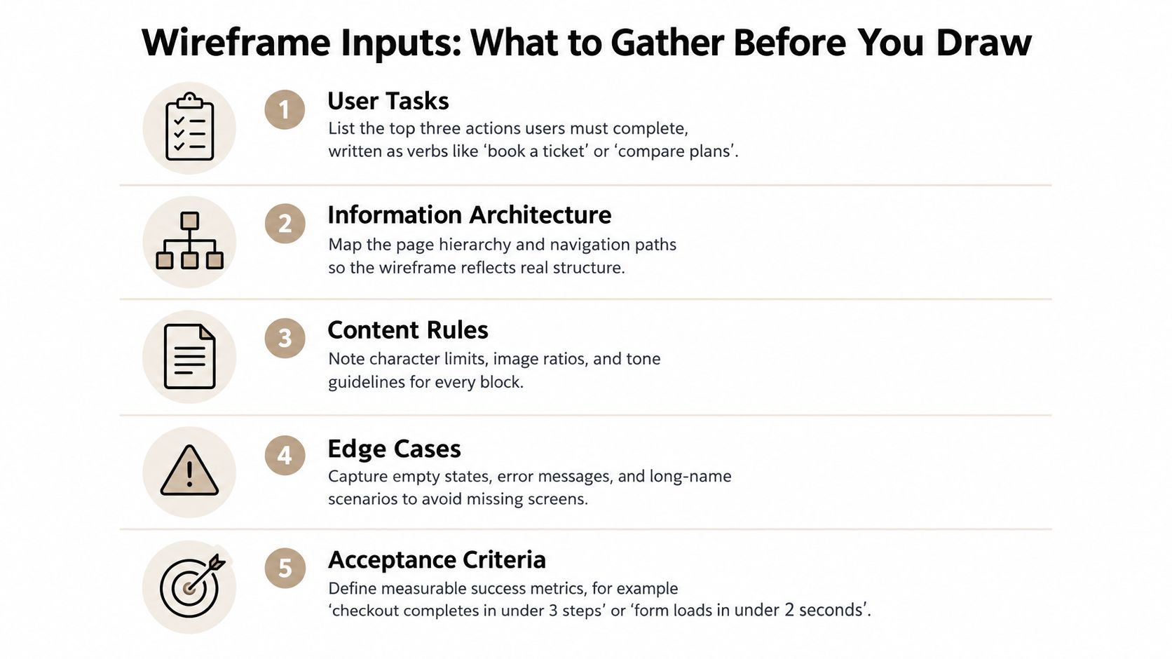
Before opening Figma, write down what the wireframe must prove. This is less elaborate than a full design sprint, but it's more demanding than asking a stakeholder what they'd like the page to contain.
Start with a one-page brief. Give it a clear product or journey name, then record the user, the task, the business constraint and the acceptance criteria. Keep the language observable. “Improve onboarding” isn't testable. “A new customer can submit an application and understand what happens next” gives the team something to design and evaluate.
Identify the work that matters first
List the three to five tasks that must succeed on the first usable release. Write each as a verb and an object, such as “compare plans”, “upload evidence” or “invite a teammate”. This prevents the team from filling a dashboard with every possible module before confirming that the core journey works.
Then map the structure around those tasks:
- Information architecture: Name the pages, parent-child relationships and navigation routes. Note where a user can enter the flow from a notification, search result or direct link.
- Content rules: Record required terminology, character limits, document formats, tone and any content that must appear before an action.
- Permissions: Show what an owner, reviewer, member or unauthorised visitor can see and do. A button that exists for one role may need to be hidden, disabled or replaced for another.
- Edge states: Include first use, no results, loading, validation failure, rejected submission, expired session and successful completion. These states often determine whether the experience feels understandable.
- Constraints: Capture existing design patterns, technical dependencies, third-party SDK limits, regulatory wording and responsive requirements.
Turn assumptions into acceptance criteria
An acceptance criterion should tell you what to observe. It might specify that a user can find the next action without assistance, recover after entering invalid information, or understand why a document is required. Avoid inventing precision to make a statement sound measurable. If the team hasn't agreed a threshold, describe the observable behaviour and agree it before testing.
This preparation also exposes disagreements early. A product owner may describe a single-step journey while compliance requires an explanation, consent or review stage. The wireframe shouldn't conceal that tension. It should make the sequence visible so the right people can resolve it.
A useful wireframe represents the product's rules, not just its intended appearance.
The distinction matters because UI and UX design operate at different levels. Your wireframe needs enough structure to represent the user's decisions, information and outcomes before the interface receives its visual language.
Moving From Sketches to a Clickable Mid-Fi Prototype
Start with pen and paper, a whiteboard or a deliberately rough canvas. Draw the main screens as simple containers and connect them in the order a user needs to move through them. Don't spend time aligning elements. At this stage, you're testing whether the journey has a coherent beginning, middle and outcome.
Sketching is useful because it lowers the social cost of disagreement. A founder is more likely to challenge a rough box labelled “verification details” than a polished screen with carefully chosen typography. When the information architecture changes, redraw it. The cheapness is the point.
Give each fidelity level a job
Use low fidelity to answer “Does this flow make sense?” It should reveal missing decisions, unnecessary steps and misplaced information. It doesn't need realistic interaction or visual branding.
Move to a mid-fidelity prototype when the route is coherent enough to test screen-level understanding. In Figma, create frames for the critical states and link the actions that matter. Use real or representative copy instead of Lorem Ipsum. A short field label, a long account name and a specific error message will expose layout and comprehension problems that placeholder text conceals.
A practical mid-fi setup usually includes:
- Named frames: Use a predictable format such as
01 - Start,02 - Details,03 - Review, and04 - Confirmation. - Reusable structures: Create shared navigation, form rows, alert blocks and action areas so a change doesn't require manual rebuilding.
- Auto layout: Let content determine height where possible. This reveals whether labels, validation messages and longer translations will push important actions out of view.
- Content variables: Keep repeated labels, statuses and example values consistent across the journey.
- Linked states: Connect success, loading, empty and error outcomes, not only the happy path.
High fidelity comes later. Colour, imagery and detailed component styling can answer visual and brand questions, but they can also distract participants from the underlying task. If a user succeeds because the finished design looks familiar, you may miss the fact that the information architecture is doing too little work.
Use content as a design constraint
Don't design around ideal copy. Put the actual terminology used by customers, regulators and support teams into the frames. If a compliance message needs careful wording, include it before testing. If a name can be long, use a long example. If an account can have no activity, show the empty state rather than assuming the screen will always contain data.
The best tool is the one that preserves the question you're trying to answer. Figma is useful for shared, clickable mid-fi work, but a notebook can be better for a five-minute structural challenge. A generated wireframe can accelerate exploration, yet it still needs human review because a plausible layout doesn't prove that the sequence reflects permissions, content or user needs.
Building Accessibility Into the Wireframe Itself
A low-fidelity wireframe isn't automatically accessible. Grey boxes can still encode a confusing heading structure, an impossible keyboard path, an unlabeled form control or an action that appears only on hover. If those decisions survive into visual design, polish won't repair the underlying exclusion.
The UK Government accessibility introduction states that accessibility should be designed from the beginning, with disabled people included in research and services meeting WCAG 2.2 Level AA where the requirements apply. Its guidance also recognises that automated checks don't identify every issue, so manual review and testing remain necessary.
Add an annotation layer
Create a dedicated annotation area beside the wireframes or a separate accessibility page in the Figma file. For every important screen, record:
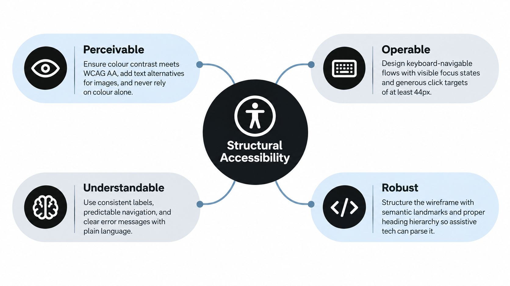
- Perceivable structure: Identify headings, text alternatives, status messages and information that must not rely on colour alone.
- Operable interaction: Show keyboard order, visible focus, skip links, modal focus behaviour and the intended operation of custom controls.
- Understandable content: State label wording, instructions, validation language, recovery options and predictable navigation.
- Reliable implementation: Mark semantic landmarks, heading hierarchy and dynamic announcements that assistive technology needs to interpret.
The annotation doesn't need to turn the wireframe into a technical specification. It needs to make assumptions reviewable. A numbered focus path can expose that a secondary link receives focus before the main action. A note about a loading announcement can prevent a screen-reader user from waiting without feedback.
Design for reflow and recovery
Model what happens when content expands, the viewport narrows or the user magnifies the page. UK accessibility guidance states that applicable content should reflow into one column without horizontal scrolling at 400% magnification. Treat this as a structural question: does the sequence remain understandable, can the user reach every control, and do errors stay connected to the fields that caused them?
The GOV.UK accessibility strategy recommends considering the four WCAG principles, testing with assistive technologies and including accessibility audits before public beta and ongoing testing after launch. That makes accessibility a wireframing acceptance gate, not a final QA note.
A structural accessibility review should happen before the team touches design-system tokens. Contrast may need higher fidelity to assess properly, but headings, labels, focus order, keyboard operation and error recovery can be decided immediately.
Testing the Wireframe With Real Users Before You Build
An untested wireframe is a guess with rectangles around it. Testing doesn't require a large research programme. It requires a focused flow, representative participants and a willingness to change the design when users struggle.
Recruit five or six participants for a qualitative usability study, following the benchmark in GOV.UK usability testing guidance. They should resemble the people who'll use the service, not merely colleagues who already understand the product. Include relevant accessibility needs, limited digital confidence and the devices or conditions that matter to the journey.
Run a task, not a presentation
Prepare three to five critical tasks. Give each participant a realistic scenario, then ask them to work through the prototype while you observe. Don't explain where to click or defend the design. Ask neutral follow-ups such as “What are you looking for?” or “What did you expect to happen?”
Record four types of evidence:
- Completion: Did the participant reach the intended outcome?
- Critical errors: Did they choose the wrong route, miss a requirement or become blocked?
- Time and friction: Where did they pause, backtrack or ask for help?
- Comments and confidence: What did they think the screen meant, and how certain were they?
Test the mobile route where mobile use is part of the product context. If network conditions affect the service, observe loading and recovery rather than testing only a fast, ideal connection. For an accessible journey, test keyboard operation and assistive technology with participants who use them. Don't infer accessibility from a visual walkthrough.
Decide what happens next
A finding matters because it threatens a task, not because it produces an interesting opinion. Prioritise a blocked core journey above a cosmetic inconsistency. Revise the flow, test the changed route again, and keep a short record of what changed and why.
| Signal | What to Look For | Action |
|---|---|---|
| Go | Participants identify the next action, complete the core task and recover from expected errors. | Proceed to higher fidelity while preserving the tested structure. |
| Revise | Participants hesitate, misunderstand labels, miss supporting information or need an explanation. | Change the relevant structure or content, then retest the task. |
| Kill | The flow depends on unsupported assumptions, blocks a critical task or excludes keyboard and assistive-technology users. | Stop polishing it. Reconsider the journey, requirement or interaction model. |
Research discipline: Don't ask users whether they like the wireframe. Watch whether they can use it.
Handing the Wireframe Off Without Losing Context
A wireframe handoff fails when the receiving team has to reconstruct the reasoning. Engineering sees boxes without states, visual design sees unresolved content and the product owner discovers important assumptions in a late comment thread.
Start the Figma file with a cover page. State the product area, the user task, the prototype link, the tested scope and the open decisions. Keep the language plain enough that someone joining the project can understand the journey without a meeting.
Organise the file for retrieval
Use named pages for the brief, user flow, wireframes, prototype, accessibility annotations and open questions. Keep component names consistent and avoid leaving abandoned explorations mixed with the validated route. If you use auto layout or variables, use them to preserve behaviour and consistency, not to create an impressive file structure that nobody can use.
The handoff should include:
- A clickable route: Link the tested journey and identify where the prototype intentionally stops.
- State coverage: Show loading, empty, validation, permission and error states that engineering needs to account for.
- Content rules: Include labels, required wording, truncation behaviour and validation messages.
- Accessibility notes: Document heading order, focus behaviour, keyboard paths, announcements and reflow intent.
- A change log: Record the decision, date, affected frames and reason for each significant revision.
- Open questions: Assign unresolved product, compliance or technical decisions to a named owner.
A short readme inside the file often prevents more confusion than a long presentation. It gives engineers a durable reference when implementation starts and gives stakeholders a place to distinguish a tested decision from an unresolved assumption.
This matters within the wider stages of software development, because a prototype sits between product definition and implementation. It should reduce ambiguity at that boundary, not become another artefact that teams interpret differently.
Digital Souls Studios LTD is one example of a studio that provides Figma interface design, wireframes, clickable prototypes and handoff alongside software delivery. Whether the work stays in-house or moves to an external team, the standard should remain the same: the file must carry the evidence and the decisions with it.
Your Wireframing Checklist and the Traps to Avoid
Pin this sequence beside your next product kickoff:
- Prepare the inputs: Define users, tasks, information architecture, content rules, constraints, edge cases and acceptance criteria.
- Sketch the journey: Challenge the structure with rough screens before visual styling creates attachment.
- Build mid-fi frames: Use realistic content, linked states and reusable structures.
- Annotate accessibility: Record headings, labels, focus order, keyboard paths, errors and responsive behaviour.
- Test with five or six users: Observe completion, errors, friction and recovery with representative participants.
- Revise by severity: Fix blocked tasks and exclusion risks before cosmetic inconsistencies.
- Hand off the evidence: Include the prototype, annotations, content rules, open questions and change log.
The common traps are predictable. Teams treat wireframes as visual deliverables, skip empty and error states, rely on colour alone, over-polish before validation and send engineering a file with no explanation of what was tested. Each shortcut moves uncertainty into a more expensive phase.
Stop wireframing when the critical journey is understood, the major states are represented, accessibility assumptions are documented and testing no longer reveals structural problems. Move to high fidelity when you need to resolve visual hierarchy or component behaviour. Move to engineering when the remaining uncertainty belongs in implementation, not because the Figma file has reached a particular level of polish.
The purpose isn't to produce attractive boxes. It's to make the build smaller, clearer and less risky.
Digital Souls Studios LTD designs and builds Figma wireframes, clickable prototypes, SaaS products and web applications for teams that need to validate the right flow before engineering begins. Visit Digital Souls Studios LTD to discuss an evidence-led MVP, redevelopment project or accessible product handoff.