5th October 2026 · 17 min
What Is UI UX Design: A Founder's Guide
You've got an MVP concept, a Figma file full of polished screens, and a development estimate that looks increasingly uncomfortable. The team can explain what the product will look like, but nobody can confidently show how a new user will discover value, recover from an error, or complete the main task without help.
That's the point at which founders usually ask, what is UI UX design, and get an answer that's technically correct but commercially unhelpful. The practical answer is simpler. UI design shapes what people see and interact with. UX design shapes whether the whole product makes sense, works efficiently, and earns continued use. For an MVP or SaaS product, you need to know which problem you're solving before you decide which design work to buy.
Table of Contents
- Defining the Core Concepts of UI and UX Design
- The Business Impact of Strategic Product Design
- Comparing Deliverables Across the Design Process
- Executing User-Centred Design in Practice
- Designing for Accessibility and UK Compliance
- Adapting Interfaces for AI and Dynamic Content
- Scoping Design Roles for Your Product Team
Defining the Core Concepts of UI and UX Design
A founder once described a product as “basically finished” because the interface looked modern. The screens had a confident colour palette, carefully chosen typography, and buttons that looked ready for launch. Yet a first-time user still had to guess which information to enter first, whether a completed form had saved, and where to go after creating an account.
That product had a UI problem in places, but its larger issue was UX. The interface looked coherent screen by screen, while the journey between those screens remained unclear.
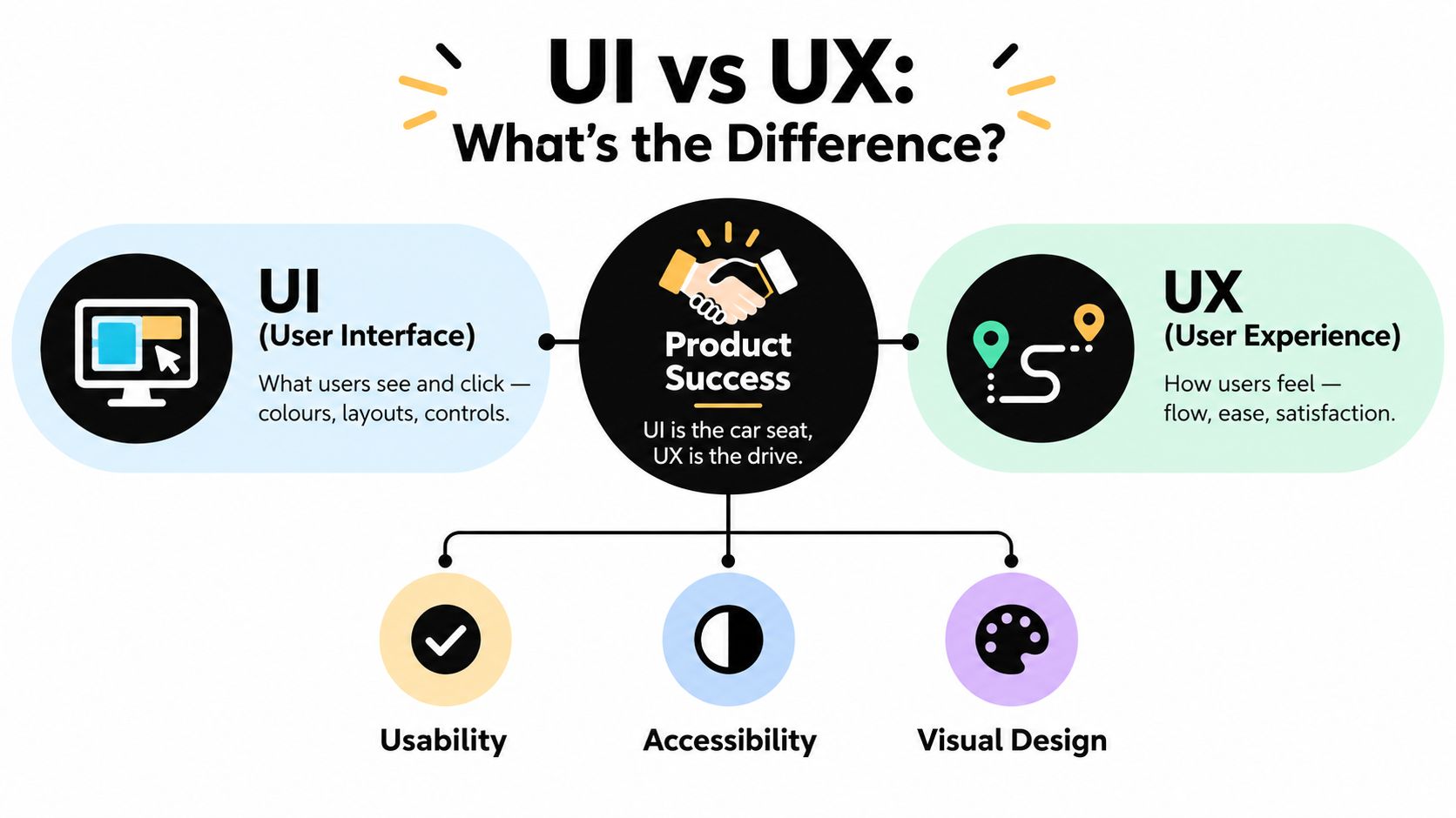
UI is the visible and interactive layer
User Interface design covers the parts of a digital product people see and operate:
- Visual hierarchy: Typography, spacing, colour, imagery, and layout tell users what matters first.
- Interactive controls: Buttons, inputs, navigation, menus, tables, alerts, and states need to communicate what can happen next.
- Consistency: A component library helps similar actions behave and appear in similar ways across the product.
- Feedback: Loading states, confirmation messages, validation, and error handling show users whether the system has understood them.
UI work often produces high-fidelity screens and interactive prototypes. It's the part stakeholders notice first, which is why teams sometimes mistake visual polish for product quality.
UX is the complete journey
User Experience design starts before the screen exists. It asks what users are trying to achieve, what prevents them from achieving it, and which sequence of actions feels natural in the circumstances. UX includes research, information architecture, user journeys, wireframes, prototyping, usability testing, content structure, and decisions about what the product should not do.
A useful house-building analogy makes the distinction clear. UX is the architectural plan, including where the rooms go, how people move through the building, and whether the layout serves its occupants. UI is the interior design and the practical finish, including materials, lighting, controls, and visual character. Attractive decoration won't fix a staircase that leads nowhere, and a logical floor plan still needs doors and switches people can use.
Practical rule: If users can't complete the main task, more visual polish is unlikely to solve the problem.
For an MVP, the distinction affects sequencing. If you're unsure whether customers understand the problem, prioritise UX research and low-fidelity testing. If the workflow is already proven but the product feels inconsistent or difficult to operate, UI execution and a reusable design system may deliver more value. Most serious products need both, but they don't always need them in equal proportions at every stage.
The Business Impact of Strategic Product Design
A founder sees support tickets rising after a new onboarding release. The interface looks polished, yet users still hesitate, choose the wrong path, and ask staff to complete basic tasks. Design becomes a business input when it changes those behaviours and reduces the work the product must support.
A well-researched onboarding flow can remove unnecessary decisions before they become support requests. A clear checkout or payment flow can reduce hesitation, while sensible information architecture can help a customer find a report without asking an account manager to locate it.
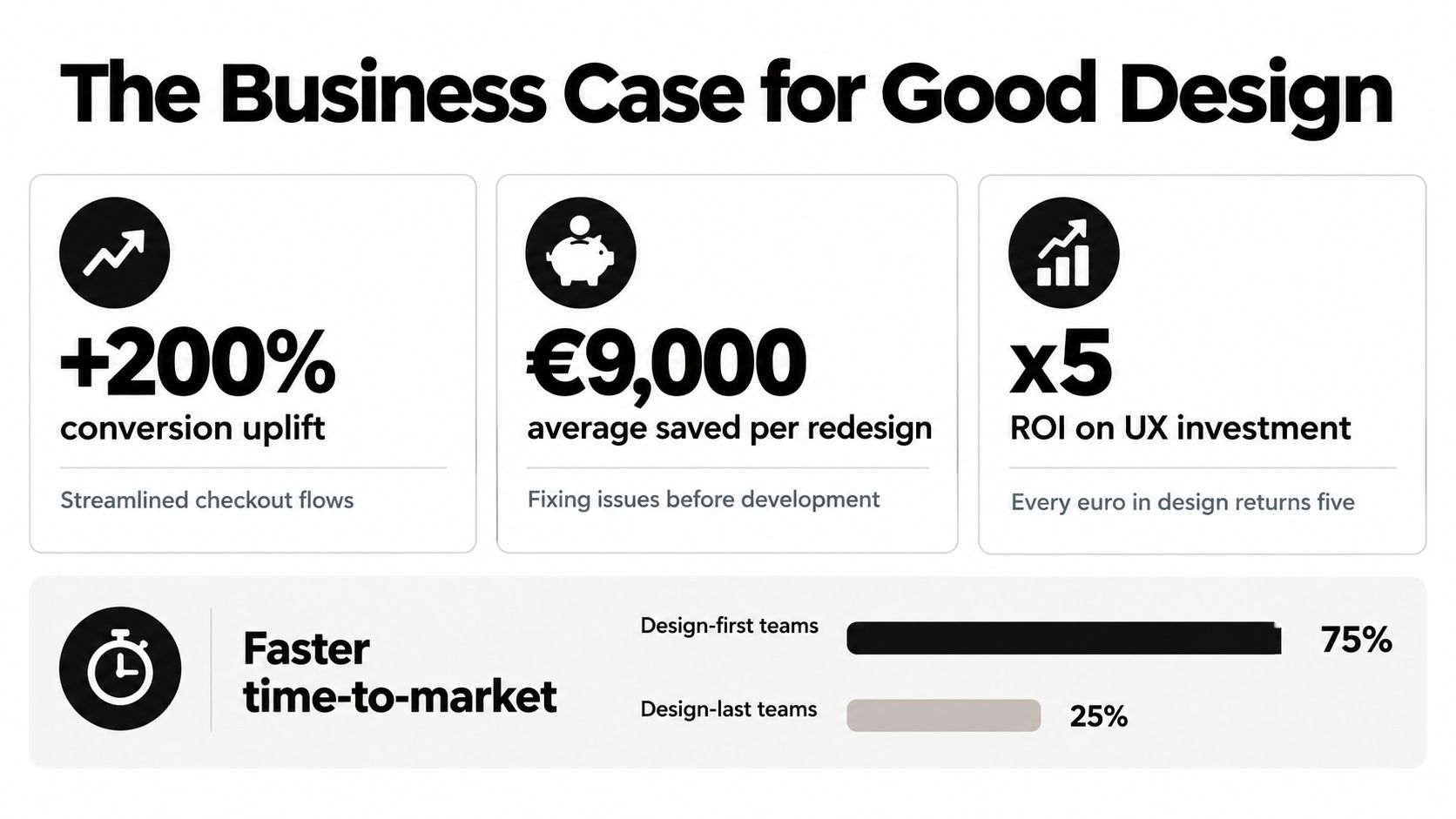
Design does not guarantee a particular conversion rate or return. It shapes the conditions in which acquisition, activation, retention, and operational efficiency take place. The founder's job is to connect each design question to a specific business risk, then decide whether research or interface execution addresses that risk first.
Design carries economic weight
The UK labour market treats UX as a specialist discipline rather than a decorative add-on. In the six months to 4 October 2026, UK job adverts citing UX Design numbered 560, with the term appearing in 0.47% of permanent vacancies and a median annual salary of £60,000, according to UK UX Design job-market data. London contract demand in the same dataset included 220 roles, representing 1.09% of London contract jobs, with a median daily rate of £450.
The same source records 355 salary quotes, with the 25th percentile at £46,129 and the 75th percentile at £70,000. These figures do not predict what a product will earn, and they should not become a simplistic design-budget formula. They do show that companies pay for UX capability at different levels, from implementation work to strategic product decisions.
Treat design as risk management
Research exposes an untested assumption while the team can still change direction. Testing a rough prototype costs less disruption than changing production architecture, rewriting support documentation, migrating data, or explaining a failed release to customers. For an MVP, that makes targeted research a practical way to decide which workflow deserves UI investment. For an established SaaS product, evidence may point instead to clearer states, faster task completion, or a reusable interface system.
The UK design economy gives that argument broader context. A 2026 report covered by Dezeen attributes £136.7bn in gross value added to the UK design economy, equivalent to 5.5% of total UK GVA, and records 2.27 million jobs after a 15% employment increase since 2020. The report also identifies around 297,000 jobs added since 2020. Design therefore forms part of a substantial economic capability, not merely a final-stage branding activity.
Ask the design team to explain each major flow. Which user need does it address? What evidence supports the sequence? What happens when the normal path fails, including accessibility needs or an AI-generated recommendation that users reject? How will the team measure whether the released experience works? A beautiful interface without those answers is an asset file, not a product strategy.
Comparing Deliverables Across the Design Process
A proposal that says “UI/UX design included” tells you very little. It could mean a tested product structure, a complete design system, or a handful of attractive screens. Founders should ask for deliverables that reveal whether the studio has addressed the product's underlying logic.
UX and UI produce different evidence
UX deliverables help the team reason about users, tasks, content, and system behaviour before implementation. UI deliverables help engineers build a consistent, usable interface once the structure has enough confidence.
| Project Phase | UX Deliverables | UI Deliverables |
|---|---|---|
| Discovery | User goals, assumptions, interview themes, service constraints, and priority journeys | Initial visual direction, moodboards, brand references, and accessibility considerations |
| Definition | Personas where useful, journey maps, task flows, information architecture, and content structure | Early type, colour, spacing, and interaction principles |
| Concept | Low-fidelity wireframes, alternative flows, and prototype hypotheses | Selected visual direction applied to representative screens |
| Validation | Clickable low or medium-fidelity prototype, usability tasks, observations, and prioritised findings | High-fidelity screens showing normal, empty, loading, success, and error states |
| Build preparation | Revised flows, edge cases, acceptance notes, and interaction specifications | Figma prototype, component library, design tokens, responsive states, and developer handoff |
| Continuous improvement | Post-launch feedback themes, behavioural questions, and proposed experiments | New components, refinements, and visual updates that preserve system consistency |
Read the proposal for what it omits
If a team jumps directly from a short brief to polished screens, ask how it will validate navigation, terminology, permissions, and unusual cases. An expense platform, for example, needs more than a dashboard. It needs a coherent route through submitting, reviewing, rejecting, correcting, and reporting expenses, including what different roles can see.
A clickable prototype is useful only if someone uses it to answer a question. A Figma file can demonstrate interaction detail, but it doesn't prove that users understand the workflow. For a practical example of how a digital product can turn a complex user need into an implemented experience, review the Minday case study.
What good handoff looks like
Developers should receive more than exported images. They need component behaviour, responsive rules, content guidance, validation states, keyboard expectations, and decisions about what happens when data is missing or delayed. Designers and engineers should resolve these points together rather than leaving interpretation to the final sprint.
For an MVP, you can reduce the breadth of the deliverables without removing the important thinking. A small product might need one priority journey, a focused prototype, a compact component set, and explicit assumptions. It doesn't need a huge design system before the team has learned which patterns will survive contact with real users.
Executing User-Centred Design in Practice
User-centred design is a working loop, not a workshop label. The team starts with a user goal, makes the smallest useful representation of the proposed solution, watches people attempt the task, and changes the design according to observed friction.
Start with the task, not the feature
Write down what a person needs to accomplish and what the organisation needs to learn. “Build an AI dashboard” is not a user goal. “Help an operations manager identify unresolved customer issues and assign the next action” gives the team something it can investigate and test.
A practical discovery sequence looks like this:
- Research the current behaviour. Speak to users, review existing support conversations, observe workarounds, and separate stated preferences from actual tasks.
- Map the critical journey. Show entry points, decisions, dependencies, permissions, errors, and the point at which the user knows the task is complete.
- Prototype the uncertain parts. Use low-fidelity wireframes when the question concerns structure. Add visual detail only when visual hierarchy or interaction feedback is the question.
- Test with representative people. Give users realistic tasks and watch where they hesitate, misinterpret labels, or take an unexpected route.
- Iterate deliberately. Record the observation, the design implication, the decision, and any remaining uncertainty before moving into production.
Include access needs in the research plan
UK government guidance requires teams to define user needs, use plain English, test prototypes with users, and continue iterating from usability evidence. The DfE service standard guidance also says that at least 1 in 5 user research participants ideally have an access need. That isn't a box to tick after the interface is finished. It changes who you recruit and what you notice during testing.
A useful session doesn't ask, “Do you like this design?” It asks the participant to complete a task while the researcher observes. If the person can't find the next action, uses the wrong term, or misses important status information, those behaviours are more valuable than a general positive reaction.
For teams moving from discovery into implementation, the web application development process should preserve this loop. Product decisions, design decisions, and engineering constraints need a shared record, otherwise the team may validate one experience and build another.
Research discipline: Test the riskiest assumption before you spend time making the surrounding interface look finished.
Designing for Accessibility and UK Compliance
Accessibility isn't an optional layer applied after the visual design has been approved. It affects the structure of the interface, the content it presents, the way people operate controls, and the technologies that can interpret the page.
GOV.UK states that digital services must not create barriers for disabled people or users of assistive technology. Its accessibility guidance for developers describes a mix of automated, manual, and assistive-technology testing across browsers and devices. That has direct consequences for implementation, including semantic structure, keyboard operation, screen-reader compatibility, magnification, speech recognition, and focus management.
Design decisions that affect access
A designer and engineer should resolve accessibility during the flow and component stages:
- Keyboard operation: Every meaningful action needs a logical focus order and a visible focus state. A custom control that works only with a pointer isn't finished.
- Semantic structure: Headings, landmarks, labels, tables, and form relationships help assistive technologies interpret the page.
- Colour and contrast: Colour shouldn't be the only way to communicate status, errors, or required information. The text and supporting visual treatment must remain understandable.
- Forms and errors: Labels should explain the requested input, and error messages should identify the problem and how to correct it.
- Motion and dynamic updates: Animation needs restraint, and updates triggered by an action should be announced or otherwise made apparent to people who can't see the screen change.
The current UK accessibility expectation referenced in the government service guidance is WCAG 2.2 Level AA. Treat that as a delivery requirement when your product serves public-sector, enterprise, or regulated environments, not as a compliance phrase to add to a project proposal.
Test the real experience
Automated tools can identify some code and contrast issues, but they won't tell you whether a keyboard user understands the sequence or whether a screen-reader user can interpret a complex status change. Manual checks and testing with assistive technologies expose problems that a visual review misses.
Accessibility can also improve the mainstream experience. Clear labels help everyone complete forms. Predictable focus and feedback help people working quickly. Plain language reduces the cognitive effort required to understand a financial, compliance, or administrative workflow. The UK guidance and tools for digital accessibility provide a useful reference point for building that work into delivery rather than treating it as a final audit.
Adapting Interfaces for AI and Dynamic Content
AI changes the interface because the system may no longer return the same path, recommendation, or answer for every person. A conversational assistant can help a user complete a task without navigating several screens, but it can also hide the available options, produce an uncertain answer, or make a critical action feel more casual than it is.
That creates a new design responsibility. The team must make the system's capabilities, limits, data use, and next steps understandable while preserving a reliable route for people who prefer direct controls.
Make dynamic behaviour legible
Personalisation works best when users can understand why content changed and can correct it when it's wrong. A recommendation that appears without explanation may feel arbitrary. A chatbot that confidently invents an answer may damage trust faster than a conventional search result that admits it found nothing.
For an AI-enabled SaaS product, design the boundaries before designing the personality:
- Show the source or status where it matters. Users need to know whether an answer came from their workspace, a connected system, or a general model response.
- Offer a safe fallback. Provide search, filters, structured navigation, or a human escalation route when the conversational path fails.
- Confirm consequential actions. Never make deletion, publication, payment, permission changes, or external communication depend on an ambiguous conversational instruction.
- Preserve user control. Explain what data the assistant can access, let users review important inputs, and make consent meaningful rather than buried.
- Design for uncertainty. Use language and visual treatment that distinguish a suggestion from a confirmed fact or completed action.
Conversational UI shouldn't become an excuse to remove information architecture. A user may ask an assistant to find a report, but the product still needs understandable permissions, document states, search results, and a way to return to the source. Teams working through those decisions should keep web application architecture aligned with the experience model, particularly where AI depends on permissions, integrations, event history, and structured content.
Build for AI search and human comprehension
AI-search-ready content is usually well-structured content. Clear headings, descriptive labels, explicit relationships, concise answers, and accessible page structure help both people and systems interpret information. This isn't a reason to write for machines at the expense of users. It's a reason to remove ambiguity.
The same principle applies inside the product. Don't let a generated summary replace the underlying evidence when a decision requires verification. Don't make the assistant the only route to a feature. Dynamic interfaces need a stable frame, visible system status, understandable language, and recovery paths just as traditional interfaces do.
Design principle: Let AI reduce effort, but never make it responsible for hiding the product's rules.
Scoping Design Roles for Your Product Team
A founder preparing an MVP rarely needs every design discipline at once. The right role depends on the uncertainty that could derail the product. Ask, what could make this product fail if we get it wrong?
If you do not yet understand the customer's workflow, prioritise UX research and product discovery. If the workflow is clear but the interface is inconsistent, slow to build, or difficult to use, prioritise UI execution and component design. If both the problem and the interaction model remain uncertain, a product designer who can research, prototype, test, and refine may be the most efficient starting point.
Choose the capability that matches the stage
For an early MVP, avoid commissioning every possible artefact. Define the main user, the core task, the riskiest assumption, and the smallest usable journey. Research should focus on decisions that might change the product scope. UI work should make that journey understandable, accessible, and credible enough to test with real users.
A SaaS product with established workflows may need a stronger UI and design-system function. That team can create reusable components, interaction states, responsive rules, and handoff documentation, so engineers do not rebuild the same patterns repeatedly. A regulated workflow, customer portal, or AI automation tool may need deeper UX and accessibility input. Permissions, trust, error recovery, comprehension, and clear system status can affect adoption as much as visual quality.
The UK market supports treating UX as a specialist capability, with vacancy and salary data covering permanent and contract roles at different levels of responsibility. Use that context to write a precise brief, rather than assuming one designer can cover research, interaction design, UI production, accessibility, and design systems equally well.
Ask better questions of a studio or candidate
Evaluate the decisions a candidate or studio can support, and how its work will reach production:
- Research capability: Can the team turn a vague product idea into testable user and business assumptions?
- Interaction skill: Can it model permissions, edge cases, empty states, errors, and recovery paths rather than only the happy path?
- UI craft: Can it produce accessible, responsive components that engineers can implement consistently?
- Product judgement: Can it explain what to leave out of the MVP and why?
- Delivery habits: Can it show how design decisions move into development, testing, launch, and iteration?
Ask for the reasoning behind sample screens, prototype evidence, component behaviour, and accessibility decisions. A polished screen tells you little about how a team handles incomplete requirements or conflicting priorities. The useful partner is the one that helps you spend development effort on a product people can understand and use, while keeping the scope small enough to learn from the MVP.
Digital Souls Studios LTD designs and builds web applications, SaaS products, AI automation, and interactive experiences, including user journeys, wireframes, clickable prototypes, Figma interfaces, component libraries, engineering, and post-launch support. If you are planning an MVP or redesign and need to connect UX decisions with accessible UI and reliable delivery, visit Digital Souls Studios LTD to discuss the product, its risks, and the next practical step.