9th October 2026 · 15 min
Web Page Redesign Guide: From Research to Launch

A web page redesign usually starts with the same uneasy moment. The site looks tired, leads are soft, the team wants “a cleaner look”, and someone senior assumes a visual refresh will fix the problem. That's the wrong frame for most UK redesigns, because the essential work sits in structure, content, accessibility, performance, and launch control.
Treating redesign as a measurable product and engineering project changes the outcome. You stop debating taste and start asking which journeys break, which templates are slow, which content is stale, and which users are blocked. That shift matters even more in the UK, where public-sector accessibility obligations and field performance constraints are not optional extras but part of the delivery spec as set out by the UK government's accessibility monitoring report and Google's Core Web Vitals guidance.
Table of Contents
- What a Web Page Redesign Really Involves
- Research and Discovery Before Any Design Work
- Information Architecture, Wireframes, and Prototypes
- Performance and Accessibility as Design Constraints
- Content Migration Without Losing Search Equity
- Cross Functional QA Before Launch
- Launch Checklist and Post-Launch Monitoring
What a Web Page Redesign Really Involves
A proper web page redesign isn't a new coat of paint. It's a controlled rebuild of how a page works, how people move through it, how search engines interpret it, and how the business proves the change helped. If you skip that reality, you usually get a prettier page that loads badly, confuses users, or breaks the old site's hard-won search equity.
The work spans several gates
A useful way to think about the process is as a sequence of artefacts, not a creative burst. Research produces evidence. Information architecture turns evidence into page structure. Wireframes and prototypes test the structure. Engineering implements performance and accessibility constraints. QA checks the build. Launch monitoring catches regressions before they settle in.
That matters because visual approval alone says almost nothing about whether the page will survive contact with real users. A design can look polished in Figma and still fail on keyboard navigation, contrast, slow phones, complex forms, or migration logic. It can also ship with content gaps, broken redirects, or analytics blind spots that make post-launch diagnosis miserable.
Practical rule: if a redesign decision can't be tied to a user problem, a technical constraint, or a business outcome, it's probably decoration.
For UK teams, that workflow has to include accessibility from the start, not as a late audit. It also needs search and content migration planning, because a redesign often changes the page's internal logic as much as its appearance. If you're building a more complex application surface as part of the redesign, the same product thinking applies to web apps too, which is why teams often separate a landing page rethink from broader application planning.
What usually goes wrong
The most common failure is compressing everything into “design”. That phrase hides the hard questions, like whether the new layout supports screen readers, whether the hero image is worth the payload, and whether the old URL needs to live on.
The second failure is approving a homepage and ignoring interior templates. Forms, checkout steps, logged-in dashboards, consent tools, and campaign pages are often where friction lives. If you only review the front door, you miss the rooms people use the most.
A successful redesign treats each stage as a checkpoint with a sign-off. The team should know what evidence is required before moving on, who owns each risk, and what will be measured after launch.
Research and Discovery Before Any Design Work
A redesign that starts in mockups usually solves the wrong problem. The first job is to establish whether the page needs a visual refresh, a conversion fix, a content restructure, or a technical rescue. That distinction matters because each one changes the workstream, the risks, and the sign-off criteria. If the team skips evidence gathering, design debates turn into opinions with no shared baseline.
Start with behaviour, not opinions
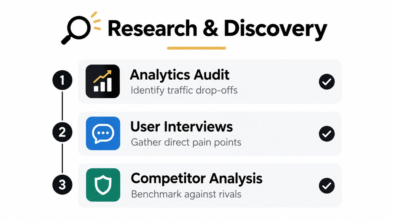
Analytics shows where people drop off, which pages hold attention, and where the current journey leaks. Heatmaps and session replays add context when stakeholders keep guessing about user intent. User interviews explain the reasons behind the behaviour, which is where a useful brief starts to form.
Competitor analysis matters, but the point is not to copy a rival homepage. Look for patterns in navigation, content hierarchy, CTA placement, trust signals, and mobile behaviour. That comparison helps expose the gap between what your site asks people to do and what the market now expects.
Keep the research in one place. Screenshots, call recordings, page notes, analytics exports, accessibility findings, and the issue log should sit together so design and engineering can trace each decision back to evidence instead of memory.
A SaaS homepage is a good example of why discovery changes the brief. If research shows a mobile drop-off on the pricing journey, the task is no longer a general refresh. It becomes a conversion problem with a clear bottleneck, so pricing clarity, trust proof, and mobile flow move ahead of decorative changes.
Capture baseline measures before anyone opens Figma
Record the current state of the page, not just the complaint. That includes conversion steps, top entry paths, accessibility issues, template performance, and content gaps. For accessibility baselines, record issues against WCAG 2.1 AA criteria and note which remediation items are compliance-critical versus cosmetic.
For discovery on more interactive products, align page research with broader application planning when the redesign includes flows, account areas, or richer UI patterns. When the page behaves like part of a product, planning for broader web applications helps the team avoid decisions that work for a landing page but fail in a deeper workflow.
A redesign brief gets sharper when it names the failed journey, the affected device, and the evidence behind it.
Discovery outputs that should survive into delivery
- A ranked problem list: top issues by user impact, commercial risk, and implementation effort.
- A content inventory: every existing page or block, tagged with owner, purpose, and keep or retire status.
- A technical baseline: current templates, integrations, scripts, and known constraints.
- A measurement plan: the metrics that will define success after launch.
If the research repo does not change the project scope, the research was not specific enough.
Information Architecture, Wireframes, and Prototypes
Information architecture is where a redesign stops being abstract and starts becoming buildable. Research tells you what is broken. Structure decides what the page should do first, which paths deserve priority, and which content should be reduced, merged, or removed.
Build structure before polish
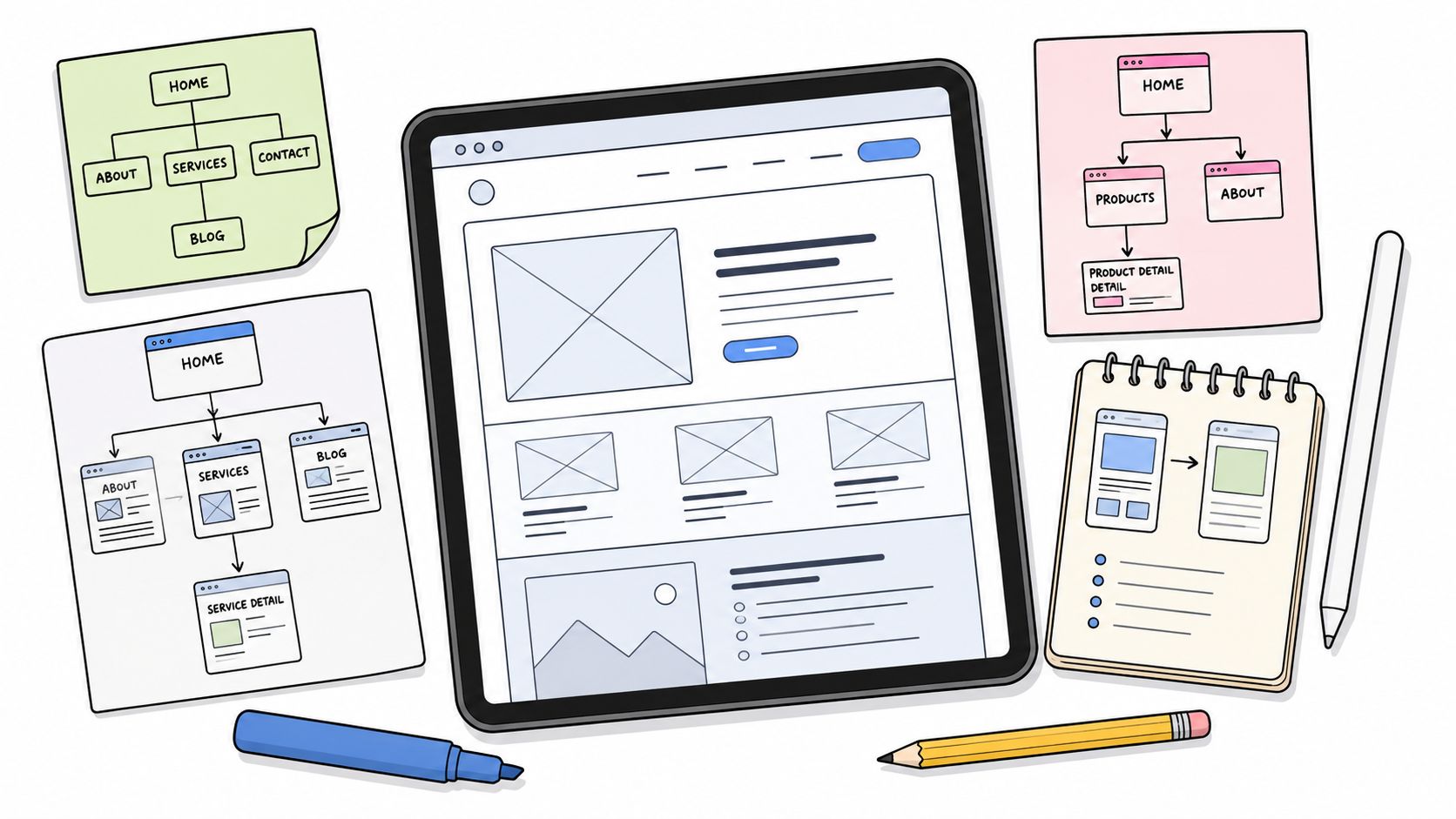
A sitemap or navigation model should make hierarchy obvious. On a landing page, the key question is which sequence of arguments gets a visitor to act. On a product page, the question is which information removes doubt fast enough to keep them moving.
Low-fidelity wireframes in Figma are enough to test that logic. A good wireframe shows content priority, hierarchy, CTA placement, form structure, and responsive behaviour. It does not need colour, motion, or polished imagery to be useful. Over-polished wireframes often hide weak decisions because stakeholders start reacting to style instead of flow. A good wireframe also keeps one eye on the UI work ahead, so this UI and UX design guide is a useful companion when the team needs to separate layout decisions from visual treatment.
A component library changes the equation. If the redesign has to scale across many pages, reusable patterns save time and cut inconsistency. If the page is highly branded or unusually content-heavy, custom sections may be justified, but they still need to map back to reusable components where possible. That trade-off matters on real projects, because what looks efficient in a single mockup can become expensive once development starts.
Prototype for decisions, not applause
Clickable prototypes exist to test assumptions, not to impress stakeholders. Keep them realistic enough that users can move through key tasks, but not so detailed that visual fidelity gets mistaken for proof. The usual failure mode is a polished demo that hides performance cost and content limits.
Run short usability tests with a small number of users who match the audience. Ask them to complete one or two meaningful tasks, then watch where they hesitate, backtrack, or miss the intended CTA. If a flow fails repeatedly here, it is cheaper to change the structure than to debug it after development.
Treat the prototype as a decision tool with an expiry date. Once the team agrees on flow, hierarchy, and copy direction, hand it over to production assets rather than letting it become a permanent parallel design.
A redesign that skips this stage usually pays later in rework. The cost shows up as development churn, stakeholder disagreement, and a build that no longer matches the business problem it was meant to solve.
Performance and Accessibility as Design Constraints
A redesign fails fast when performance and accessibility are treated as polish. They shape layout, component choice, content density, and feature scope before the first build ticket is written. If teams leave them to the end, they end up cutting ideas that were never budgeted properly.
Set budgets before visual polish
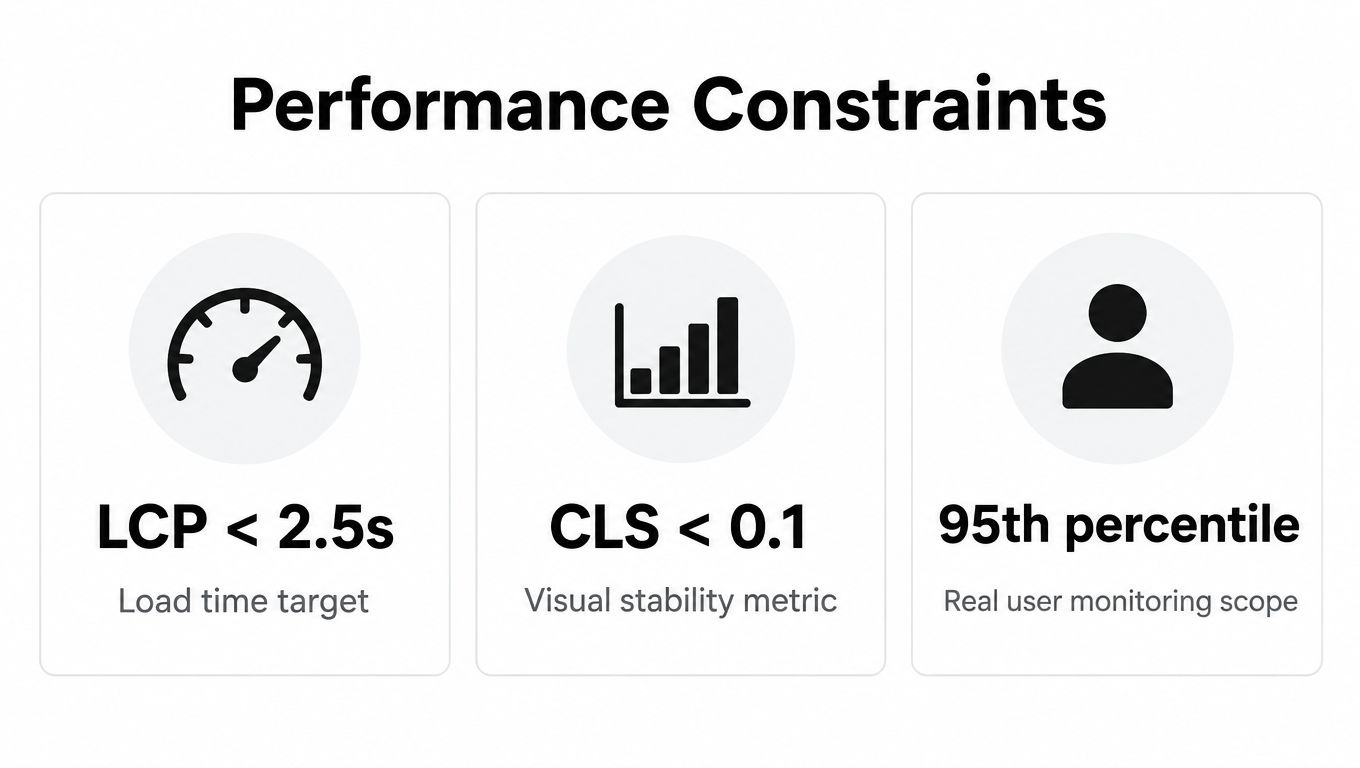
Google defines Core Web Vitals around Largest Contentful Paint, Interaction to Next Paint, and Cumulative Layout Shift using real-user measurements in its Search Console guidance. For a redesign, that means agreeing acceptable page behaviour before animation and visual treatments are finalised. Otherwise, the design system grows around assets the browser cannot deliver smoothly.
The trade-off is straightforward. Motion, video, chat widgets, consent tools, analytics tags, and AI features all draw from the same mobile budget. If every feature ships by default, the page can feel busy even when the layout looks clean. Selective loading, progressive enhancement, and deferral usually serve the page better than unconditional inclusion.
A useful acceptance criterion names the page template, the device class, and the constraint. “Looks fast” is too vague. “Passes field performance at the 75th percentile for the live template” gives engineers something they can test in staging and at release.
Accessibility should be built into the page structure
Public-sector accessibility rules turn compliance into a delivery requirement, and government monitoring found issues across most tested sites in the 2020 to 2021 report. That means more than alt text. Keyboard access, contrast, content hierarchy, and screen-reader support need to work at the template level.
WCAG 2.1 AA checks should shape component design. If a button cannot be reached easily, if heading order is unclear, or if a modal traps focus, those problems belong in the interface definition. They are not separate from design quality.
Practical rule: if a component fails keyboard use, it is not finished, even if it looks finished.
For teams working on more complex product surfaces, the same constraint-led mindset applies to system design and frontend planning. Web application architecture matters here because performance and accessibility decisions depend on how the stack is wired underneath.
Make the trade-offs visible to the team
- Defer non-critical motion: Keep the page responsive first, then add flourish where it does not hurt interaction.
- Limit third-party scripts: Each widget should earn its place against a clear task need.
- Reserve layout space: Images, embeds, and banners need defined dimensions so the page does not jump.
- Check the forms: Labels, error states, and focus order matter more than decorative sections.
A page that cannot be explained in terms of user tasks and delivery budgets has probably been designed from the outside in. That approach often produces something attractive, but hard to operate.
Content Migration Without Losing Search Equity
A redesign can lose search visibility in a single afternoon if content migration is sloppy. The new page may look stronger, but if URLs, metadata, internal links, and canonicals aren't mapped properly, the old page's equity can fall through the cracks. When design projects slip into SEO recovery work, the consequences are immediate.
Build the redirect map from evidence
Start with a crawl of the existing site and a list of pages that really matter. Then map each live URL to its replacement, or confirm that it should be retired. One-to-one redirects are safest when the old page has a clear new home. Broader redirects make sense when content has been consolidated, but they need care so you don't send users to an unrelated section.
Metadata templates matter just as much as redirects. Title tags, descriptions, canonical tags, image alt text, and structured data should be carried over or rewritten in a way that matches the new information architecture. Internal links should also be updated so the new page doesn't depend on redirects to pass users around the site.
A key mistake is pruning content without governance. If no one owns old pages after launch, outdated copy hangs around, support tickets rise, and teams start publishing duplicate material to patch gaps. Content ownership has to be clear before cutover.
Redirect choices should match the scenario
| Scenario | Recommended action | Risk if ignored |
|---|---|---|
| Page keeps the same intent but gets a new URL | Use a one-to-one 301 redirect | Users and crawlers land on broken or irrelevant pages |
| Several old pages become one stronger page | Redirect each old page to the most relevant consolidated page | Link equity fragments and users get confused |
| Outdated content is fully retired | Redirect to the closest supporting page, or remove only if no substitute exists | Dead ends, crawl waste, and poor user recovery |
| URL pattern changes across a section | Use carefully tested pattern-based redirects | Accidental mismatches across many pages |
Validate before the switch
A staged crawl of the redesigned site should confirm that the new internal links, canonicals, metadata, and image text all behave as intended. If the crawl shows missing templates or orphaned pages, fix those before launch rather than discovering them in search console later.
Keep the content brief process tight too. New pages should ship with owner, purpose, target query or task, CTA, and update rules. That keeps design, copy, and governance aligned instead of relying on a one-time launch push.
Cross Functional QA Before Launch
QA is where the redesign either becomes shippable or gets honest. This isn't just a visual check. It's a cross-functional review of how the build behaves under normal use, awkward use, and user error. If a team treats QA as a final quick look, it usually misses the exact faults that frustrate customers most.

Test the real journeys
Forms, search, filters, checkout, sign-in, consent handling, and AI or chatbot features all need hands-on testing. If the page has multiple states, each one needs to be checked on the browsers and devices the audience uses. A design that behaves in Chrome on a laptop but breaks on a smaller mobile browser is not launch-ready.
Accessibility testing should combine automation with manual checks. Automated tools catch recurring code issues, but they don't tell you whether the flow is readable, logical, or operable by someone using only a keyboard or screen reader. Zoom testing is important too, because redesigned layouts often fall apart when text grows or elements wrap.
Performance checks belong in staging, not in hopeful post-launch cleanup. Run Lighthouse and WebPageTest against the redesigned build, then compare the hotspots to the earlier budget. If the page fails under realistic conditions, accept the trade-off or change the component. Don't assume users will tolerate it.
Make bug reports useful
A good bug report contains the page, the device or browser, the exact issue, the expected result, and a screenshot or short recording. That gives engineers enough context to fix the problem without a follow-up call. It also avoids the vague “something looks off” problem that slows everything down.
Load testing matters for SaaS and ecommerce launches, especially if the redesign touches authenticated areas or purchase flows. Content review should happen in parallel, because inaccurate or inconsistent copy can survive every technical check and still damage trust. Final sign-off should name the owner for each risk so nobody is left holding a problem they didn't approve.
Launch Checklist and Post-Launch Monitoring
Launch day should feel controlled, not heroic. If the team has to improvise backups, redirects, analytics, or ownership on the day, the cutover was underprepared. The safer approach is a short checklist, a named runbook, and a clear rollback threshold if the new page starts misbehaving.
Pre-launch, confirm backups, redirect maps, analytics tags, consent mode, monitoring, and search console access. On launch day, verify the most important journeys first, then check traffic, conversions, error rates, Core Web Vitals, and accessibility regressions. After launch, watch support tickets and behaviour changes closely enough to catch problems while they're still small.
Don't wait for a weekly report if the live page is breaking forms or losing sessions in the first hour.
A practical 30-day review should record what went well, what surprised the team, and which assumptions turned out to be wrong. That record becomes the basis for the next iteration, not a post-mortem nobody reads.
Digital Souls Studios LTD designs and builds redesigns that connect UI/UX, engineering, performance, and launch support in one workflow. If you need a partner for a UK web page redesign that treats accessibility, content migration, and Core Web Vitals as delivery requirements, visit Digital Souls Studios LTD and outline the page, product, or site you want to improve.